Case Study
Portfolio Paradox
Designing a Website that is the Case Study.
I tackled the challenge of creating a portfolio that's both a showcase of my work and a demonstration of my process.
Screenshot of the hero section of this website opened in Webflow.
Introduction
Challenge
How can a portfolio website be the demonstration of skill, not just a container? The challenge was to design and build a site that showcased my UI/UX process, Webflow expertise, and coding ability through its very structure and interactions, while also standing out.
‍Role
As the sole UI/UX Designer, Webflow Developer, and Animator for this project, I was responsible for the entire process from concept and research to final implementation and custom code.
Solution
The solution is the live portfolio website you're currently viewing.
Key Outcomes/Results
Successfully launched a unique portfolio demonstrating advanced Webflow skills, Rive integration, and custom JS/CSS. Resulted in positive feedback from peers/recruiters and mastery of new technologies like Rive.
Concise Process Overview
My process involved Research (analyzing portfolios, defining target audience needs), Design (sketching, wireframing in Figma, iterating on feedback), Development (building in Webflow, implementing interactions), and Custom Implementation (writing JS for filtering/effects, integrating Rive animation)
The Challenge
The Portfolio Problem
The challenge of creating a UI/UX portfolio is unique: the portfolio itself must embody the very skills it's meant to showcase. It's not enough to simply present projects; the portfolio's design, functionality, and user experience must be a project in its own right.
Specific Challenges & Constraints
Standing Out
With countless UI/UX portfolios online, I needed to create something that would genuinely stand out and capture the attention of busy recruiters and hiring managers.
Demonstrating Skills
I wanted the portfolio's structure, interactions, and even its code to be a testament to my abilities, rather than just a static display of past work.
Learning New Technologies
I saw this as an opportunity to master Webflow interactions, learn Rive animation from scratch, and implement custom JavaScript filtering – all while working within a self-imposed tight timeline.
Webflow Basic Plan Limitations
Since I was using Webflow's Basic plan, I couldn't rely on the built-in CMS for dynamic filtering. This constraint forced me to find a creative, code-based solution.
Time constraint
I wanted to have the first version ready in under two weeks, to start applying to jobs
My Approach - Process & Methodology
Research & Planning
Competitive Analysis
I began by analyzing over 20 UI/UX portfolios from designers I admired, as well as those featured on sites like designlab and Bestfolios. I focused on identifying common patterns, successful approaches, and areas where many portfolios fell short.
Screenshot of the Portfolio Home from Florinda Sgueglia from march 2025.
Open in New icon.
Inspired me with its clean layout and clear case study presentation.
Screenshot of the Portfolio "Selected works" from Dusa Miao from march 2025.
Open in New icon.
Got me hooked with fascinating projects communicated with amazing compositions.
Second I searched and looked at modern websites as well as recommended webflow pages. I focused on what makes the pages special and great to use, I kept my timeline in mind to dismiss elements that were not worth the time to implement quickly.
A screenshot of the iPhone 16 Pro website from apple.com.
Open in New icon.
Inspires to experiment with intuitive, interesting scrolling behaviours while keeping and a clean look.
A screenshot of the refokus.com website showing a hero section.
Open in New icon.
Influenced me in my decision for the hero animation and project cards heavily.
User Research - Target Audience Feedback
I reached out to several recruiters and hiring managers in my network and conducted informal interviews to understand their priorities when reviewing portfolios. I also shared early wireframes with fellow designers to gather feedback on the structure and usability.
One recruiter emphasized the need for a clear and concise presentation of my design process
Quote marks icon.
I want to see how you think, not just the final result.
Quote marks icon.
After reviewing an early version, a senior designer gave me this valuable feedback
Quote marks icon.
Think of your portfolio as a user experience. How can you make it intuitive, engaging, and memorable for someone who's seeing your work for the first time?
Quote marks icon.
Technical Research
To overcome the limitations of Webflow's Basic plan, I researched alternative filtering methods. This led me to Finsweet's CMS Filter library, which I learned to implement through their documentation and tutorials. I also explored Webflow's interactions documentation to understand how to create custom hover effects and animations.
Ideation & Design
Sketches & Wireframes
I started with rough paper sketches to explore different layout options and navigation patterns. I then created low-fidelity wireframes in Figma to define the information architecture and user flow.
Mood Board
To establish a visual direction, I created a mood board that captured the desired aesthetic: modern, clean, with a touch of personality through subtle animations and three vibrant accent color. The accent colors are inspired by the base colors, cyan, magenta, & yellow.
A moodboard for a cyan magenta & yellow color palette with many different color matching imagery.
CMYG Pastel Color Palette Moodboard.
Iterative Design
Based on feedback from my initial user research, I iterated on the wireframes, simplifying the navigation, making the case study sections more prominent, and making the hero more unique to catch the viewers attention. I also experimented with different approaches to the filtering system before settling on the final implementation.
A visual showing the iterative design approach with the first wireframe on the left and the second ond the right after the feedback.
Key Design Decisions
Layout & Navigation
I chose a single-page layout with a filter bar to provide a seamless browsing experience and allow users to quickly find relevant projects. The vertical scrolling layout is optimized for both desktop and mobile viewing.
Visual Design
The visual design is clean and minimalist, with a dark color palette that allows the project images to stand out. The vibrant cyan, magenta & green accent colors add a touch of personality and draw attention to key interactive elements. I used Inter for its readability and modern aesthetic and Sine for it's bold character set and uniquness.
Interactions & Animations
I incorporated subtle hover effects on project items and filter buttons to provide visual feedback and enhance engagement. The Rive animation in the hero section adds a unique touch and showcases my ability to learn and implement new technologies. The filtering system provides immediate visual feedback, making it clear which projects are being displayed. The big teaser on the stories is the perfect eye catcher and it's reaction to the mouse movement further enhances engagement.
Accessibility
I ensured sufficient color contrast throughout the site, provided alt text for all images, and tested the keyboard navigation to ensure the portfolio is accessible to users with disabilities.
Technical Implementation
Webflow Development
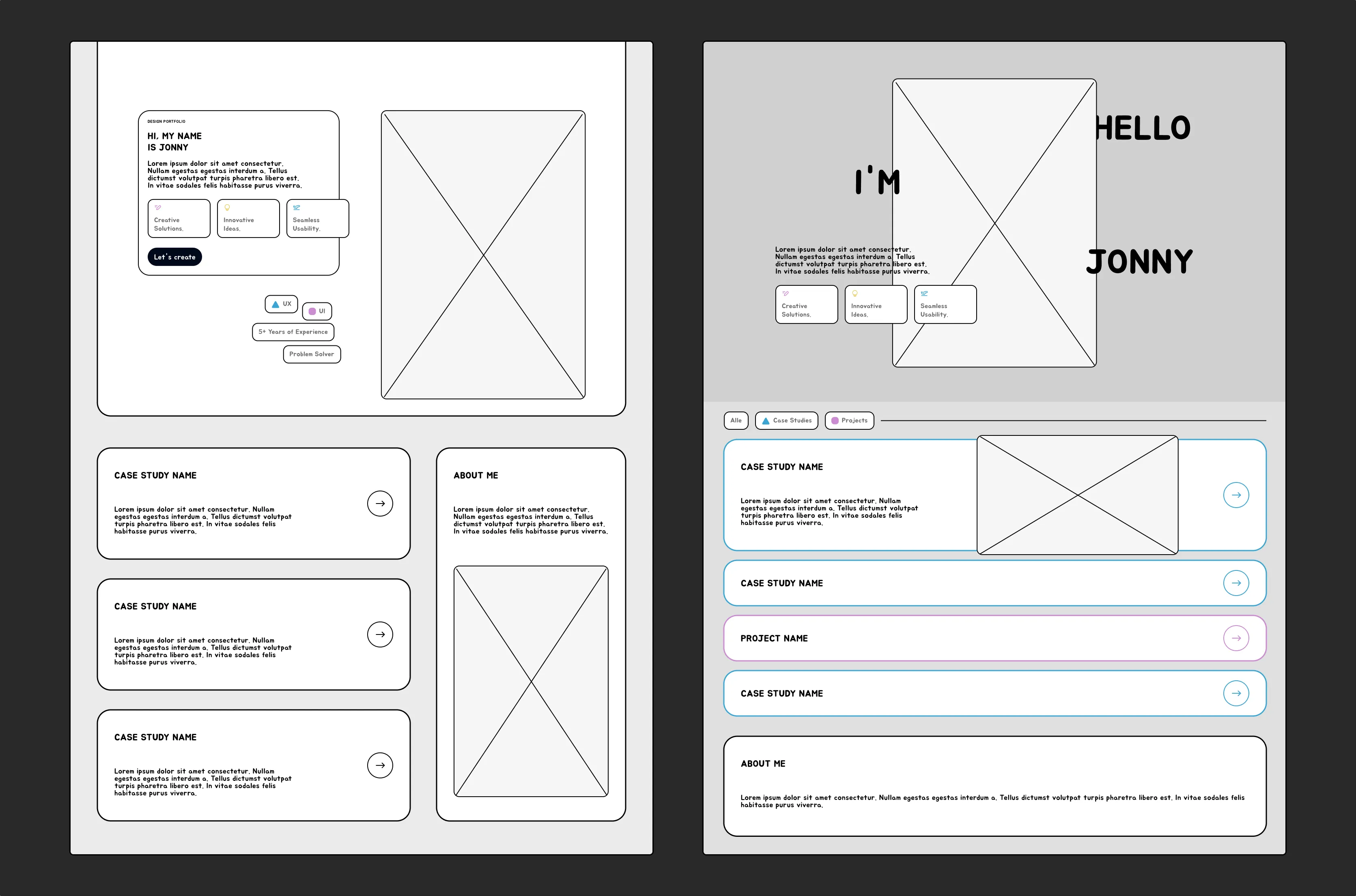
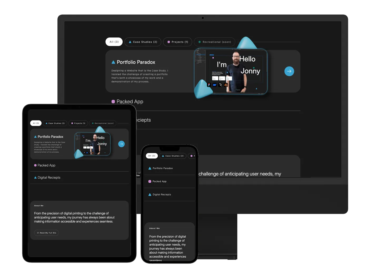
I built the portfolio entirely in Webflow, leveraging its visual editor and interactions features. I used a combination of divs and flexbox for layout, and custom attributes to implement the dynamic filtering.
One challenge I faced was ensuring the sticky navigation behaved correctly on all screen sizes. I overcame this by using a combination of Webflow's built-in responsiveness features and custom CSS media queries.
Rive Animation
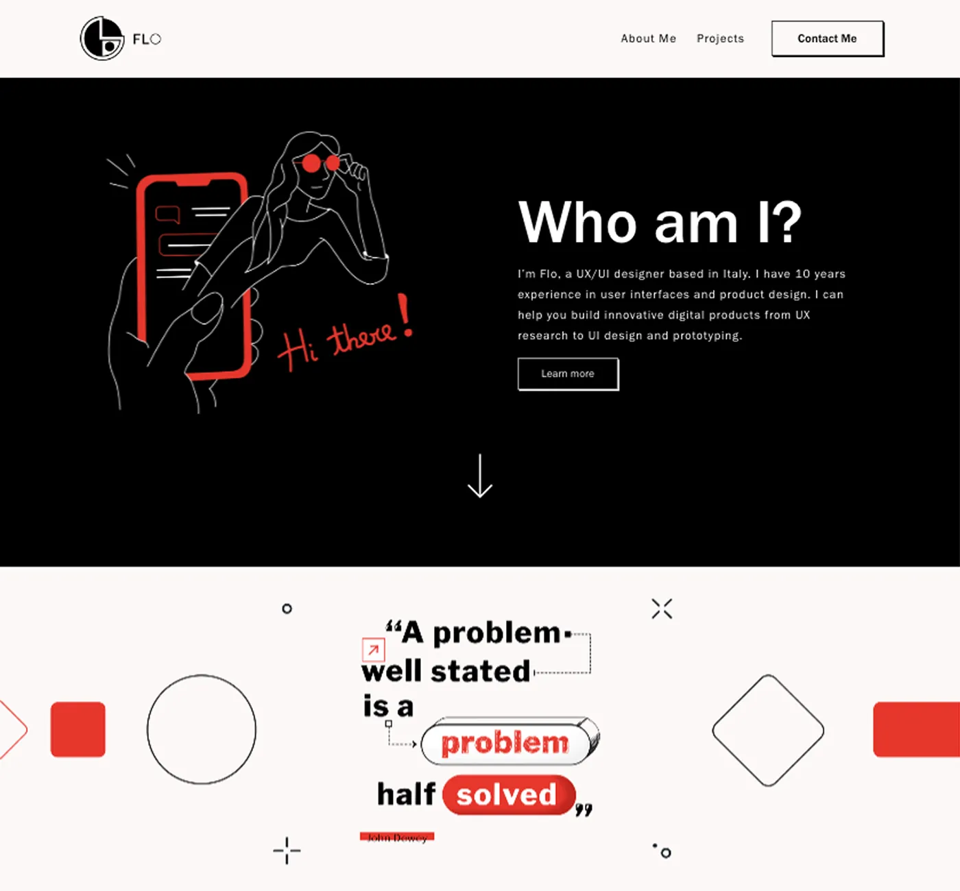
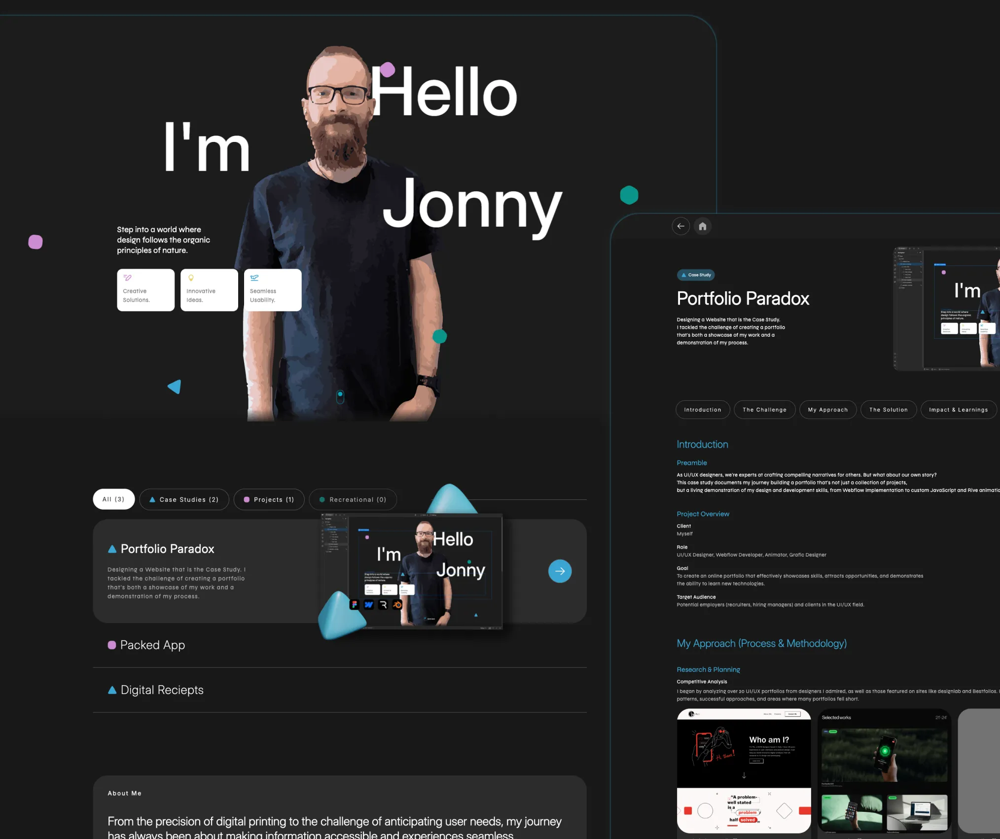
I picked up how Rive works quickly, after a little research on state machines, triggered animations were also a breeze. I designed a plane starting & landing, a bulb flashing, a pen writing & a floating shapes animations to add visual interest to the hero section and demonstrate my ability to create engaging motion graphics.
Mockup of the Rive State Machine.
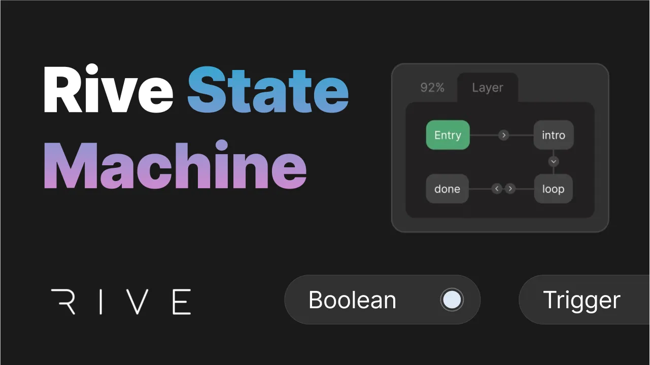
The state machine allows the animation to respond to user interaction, transitioning between different states based on mouse hover.
Integrating the Rive animation into Webflow involved exporting the .riv file and using Webflow's Rive element. I had to troubleshoot some initial issues with the animation playback, which I resolved by carefully reviewing the Rive documentation and Webflow's integration guide.
Custom Code
To implement the dynamic filtering without Webflow's CMS, I wrote custom JavaScript using the Finsweet CMS Filter library. This code adds and removes CSS classes to project items based on the selected filter, allowing me to show and hide projects dynamically.
The Solution
Key Features
Filtering in Action
The custom-built filtering system allows users to quickly switch between 'All,' 'Case Studies', 'Projects', & Recreational.
Short looped video of the filtering in action.
Rive Animation
The hero section features a subtle Rive animation that adds visual interest and showcases my animation skills.
A few of the animations. Hover your mouse or tap to play.
Hover Effects
Hovering over project items reveals additional information and creates a interactive card effect.
Looped video recording of the hover effect.
Responsive Design
The portfolio is fully responsive, adapting seamlessly to different screen sizes.
Mockups showing desktop, tablet, and mobile views.
Impact & Learnings
Results & Impact
Qualitative Feedback
Since launching my portfolio, I've received positive feedback from recruiters and fellow designers, who have praised its clean design, intuitive navigation, and clear presentation of my design process.
A Recruiter on the Portfolio's Approach:
Quote marks icon.
You don't see many portfolios built like this – it really helps you stand out from the crowd.
Quote marks icon.
Feedback from a Designer Colleague:
Quote marks icon.
Love the Rive animation and the little hover details – they add a lot of personality and make it genuinely enjoyable to navigate.
Quote marks icon.
Quantitative Data
-will be added as soon as available-
Skills Acquired
Through this project, I significantly expanded my skills in Webflow, mastering advanced interactions and custom code integration. I also gained practical experience with Rive, adding a valuable new tool to my design skillset. Finally, I honed my JavaScript debugging skills, learning to troubleshoot complex interactions effectively.
Lessons Learned
Key Challenges
The biggest challenge was fitting a private project into the schedule while working full-time. I'm sure this is common for most and relatable.
What I'd Do Differently
If I were to start over, I would allocate more time for user testing earlier in the design process. While I did gather some initial feedback, more extensive testing could have revealed further opportunities for improvement.
I also would take more time to research best practices in Webflow. Although I was quite happy with my class naming convention in the end, i think the Finsweet reccomendations would have saved me some time.
Key Takeaways
This project reinforced the importance of a user-centered design process, even when the 'client' is myself. It also demonstrated the power of combining visual design tools like Webflow with custom code and animations to create truly unique and interactive experiences.
Thank you for reading my case study about the Portfolio Paradox - Designing a Website that is the Case Study.
About Me
From the precision of digital printing to the challenge of anticipating user needs, my journey has always been about making information accessible and experiences seamless.